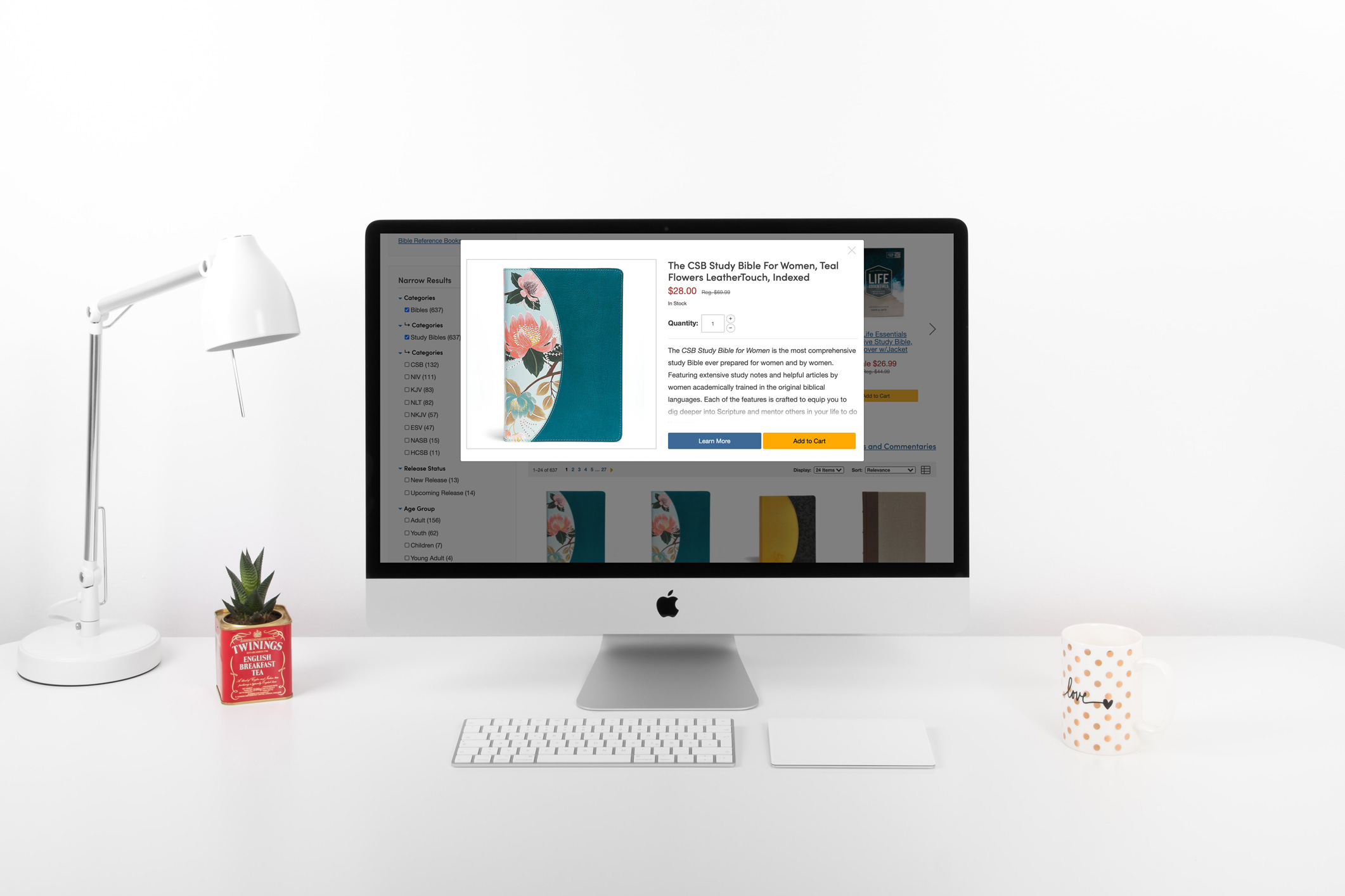
Product Grid Quickview
Skills: UI Design & Development, UX Design
Scope: March 18th - June 18th, 2020
Goal
Give users the ability to quickly view details of a product from the product grid without being directed to the product detail page. The objectives were customer conversions and user interaction.
Result
An easy and efficient way to allow a user to quickly view product details without hindering their shopping experience. Working closely with our Adobe Analytics & Adobe Target specialist, the design was found to increase overall customer interaction, resulting in increased revenue. Users wanted to use the design and it only encouraged more purchases overall.
Process
- Competitor Analysis to see what worked and what didn’t for other ecommerce platforms.
- Develop screens to have a visual representation of what may work
- Test designs against a constant to see what responded the best.
- Took test results and designed an improved version that was then tested again.
- Took the winning result and develop and implement the new designs.
Competitor Analysis
I decided to see what the competition did for a similar functionality. Three of the websites I reviewed were anntaylor.com, wayfair.com and kohler.com. These were helpful in ideating what would potentially work for my project.


First Iteration

In this first iteration it was decided that on hover we would reveal a transparent background over the image with the Quick View button in the center. The thought was that having the quick view button on hover covering the product image would work, but that did not work. Because both the button and the transparent background contained the quick view link, it resulted in unwanted interactions. Users were expecting to go to the product grid if they did not click on the button, however they were always presented with the quick view modal. Although it was a negative expereicne we did glean helpful information. The users that interacted with the quick view willingly, did convert, but there were a lot of users that showed signs for wanting to see the product grid instead of the modal.
We ran this version against what we had on the site and received a negative result, because of the disruption of the user flow. This iteration drove RPV (Revenue Per Visit) down by -10.4% and Conversation Rate by -4.8%. For this reason, we dropped this version of the test and I created a new iteration to go against the control using the information we received.
Final Iteration
In this iteration I go after an approach that lended more to the user's decision. With this goal in mind, I removed the transparent background and reduced the quick view's call to action footprint. Because the hover interation was removed I had to figure out a way to still make the call to action visible but not interruptive. This lead to a small, but recognizable icon at the bottom right of the image. If a user wanted to interact with it they could, and if not it could be easily ignored.


Final Result
After making changes to the design, users showed through data that they liked having a quickview on the site. It increased conversion by 1%, RPV by 3.9% and raised the Average RPV from $4.86 to $7.81 (an increase of 60%).
